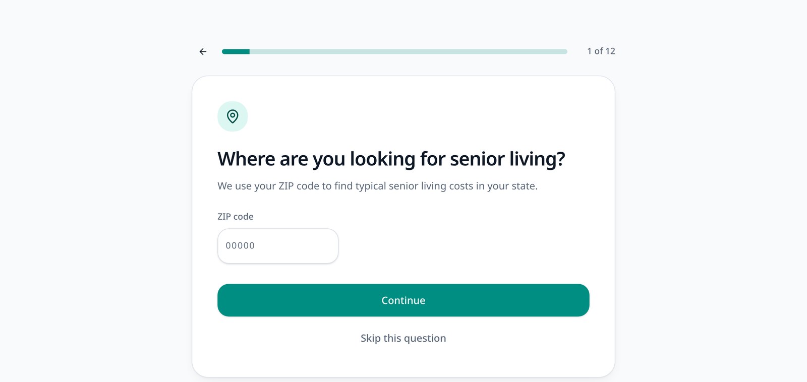
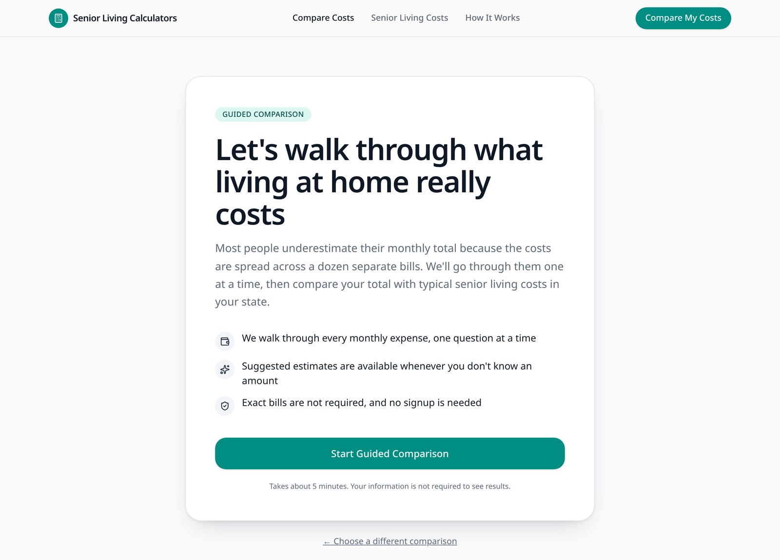
Guided Cost Comparison
A step-by-step comparison that helps families identify their current living expenses and compare them with your community's pricing.
Best for: Families who want the most complete comparison
Give families an easier way to understand your pricing, compare their current expenses, and see the value of senior living before they ever talk to your sales team.
Publish the experience that fits each page — all three use the same community pricing and the same reporting.
A step-by-step comparison that helps families identify their current living expenses and compare them with your community's pricing.
Best for: Families who want the most complete comparison
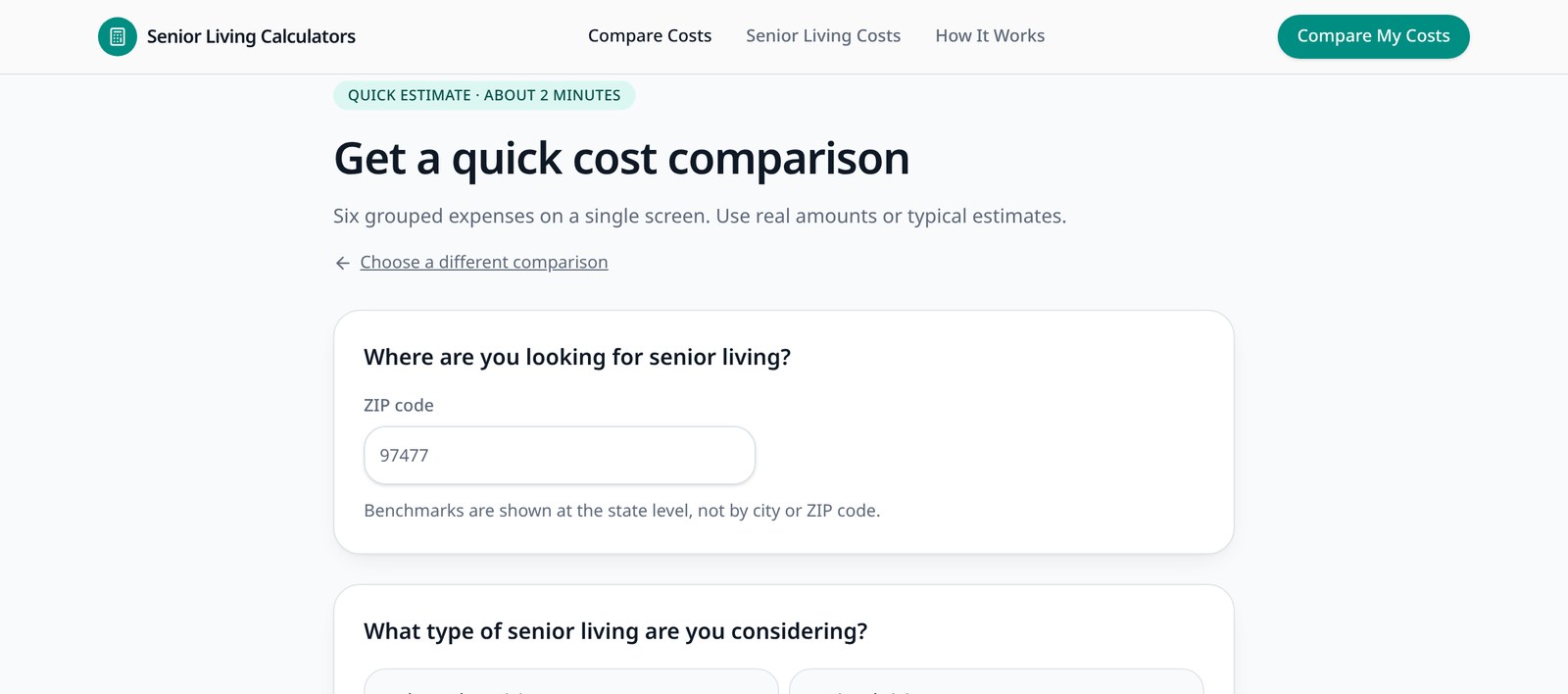
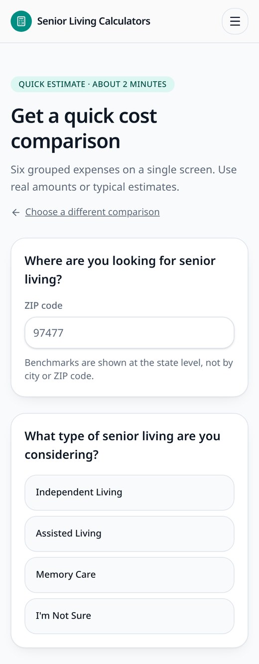
A faster grouped-expense experience for visitors who want a quick estimate in a couple of minutes.
Best for: Website visitors who want a fast estimate
A detailed worksheet-style comparison with section subtotals and a running monthly total.
Best for: Sales counselors, families working together, and in-person conversations
We also publish a consumer-facing Local Senior Living Cost Comparison on this site. It uses regional benchmark data rather than your community pricing, so it sits outside the operator calculator suite.
Families often compare a senior living monthly rate against only a mortgage or rent payment, while the rest of their current household spending stays invisible.
The calculators walk through the broader financial picture so the comparison is complete and honest. Depending on the household and community, senior living may cost more, less, or roughly the same — the goal is clarity, not a predetermined answer.
Commonly overlooked monthly expenses
Each of these is captured in the comparison, then set beside your community's monthly cost so families can see the real difference.
Embed a branded cost calculator on your pricing, assisted living, memory care, or financial resources page without rebuilding your website.
Each calculator can use the pricing, fees, care structure, and included services for the specific community where it is published.
Families see their results first, then choose to share their information — lower friction than gating the calculator before any answer.
Reporting in the operator dashboard shows how each calculator performs.
Manage every community from one organization account, with pricing and branding that stay specific to each building.
Add every building in your portfolio without spinning up separate logins.
Set defaults once at the organization level and let communities inherit them.
Rates, fees, and care pricing stay accurate for each individual community.
Logo, colors, and imagery follow the community the calculator belongs to.
Corporate, regional, and community-level roles with invite-only access.
One dashboard across the portfolio, with per-community performance.
We will walk through your communities, pricing structure, and where the calculators would live on your website.
Operator accounts are created by our team — access is not self-service.